Santander Value Prediction Challengeをやってみるメモ2
実際データを触る前に事前確認 をいくつかしておこうと思う。
依頼主は?
サンタンデールというスペインの銀行
依頼主の課題は?
一人一人にパーソナライズしたサービスを提案したいが、金融サービスの選択肢が非常に多いため誰に何を提供すれば良いのかよくわからない
なんでこれを予測/分類したいの?
多様化して、競争が激化していく中より競合に対して優位なサービスを提供したいからだと思うけど、何に関するデータなのかは関係がない可能性がある。
kaggleならdiscussion確認した?
なんか、色々Leakでスコアがめっちゃあり得ない状況になっているらしいけど、気にしない。20180716時点。
Discussionを見ていて気になったこと。
- LBとかLocal CVとか意味がわからない
- Local CV 1.34 ===> LB score 1.47, Overfitting???
- Reducing the number of features [1.39 LB]
CVはCross validation, LBはKaggleのLeader Boardの意味でした
[ref] datascience.stackexchange.com
次からEDAとかやっていきます。
Santander Value Prediction Challengeをやってみるメモ1
Banco Santanderってなに?
サンタンデール銀行は、スペイン・マドリードに本拠を置く、スペイン最大の商業銀行グループである。マドリード証券取引所、ユーロネクスト、イタリア証券取引所、ロンドン証券取引所、ニューヨーク証券取引所上場企業。
なにをすればいいの?
Epsilonの調査によると、パーソナライズされたサービスを提供する場合、顧客の80%があなたとビジネスを行う可能性が高くなります。銀行業務も例外ではありません。
日常生活のデジタル化は、顧客がサービスをパーソナライズされたタイムリーな方法で提供することを期待していることを意味します。第3回Kaggle大会において、Santander Groupは、顧客に金融サービスを提供する必要があり、顧客の取引の金額または金額を決定する意向であることを認識すること以外に、一歩前進することを目指しています。これは、より具体的ではあるが単純で個人的な方法で顧客のニーズを予測することを意味します。金融サービスの選択肢が非常に多いため、これまで以上に多くのニーズがあります。
この大会では、サンタンデール・グループは、Kagglersに潜在顧客ごとの取引価値を特定するのを助けるように要請しています。これは、サンタンデールがサービスをパーソナライズするために必要な最初のステップです。
評価基準は?
この競技会の評価基準は、「Root Mean Squared Logarithmic Error」です。 日本語では標準二乗対数誤差というみたい
XGboostをIris datasetを使ってJupyter notebookで回す
XGBoostのインストール及びirisデータセットの読み込み
import xgboost as xgb
from sklearn import datasets

iris = datasets.load_iris()
X = iris.data
y = iris.target
説明変数と目的変数を交差検証のために、テストデータと訓練データに分割.
from sklearn.cross_validation import train_test_split
X_train, X_test, y_train, y_test = train_test_split(X, y, test_size=0.2, random_state=42)
Xgboostを使うためにはDMatrix data formatという特定のフォーマットに変換する必要があります。Xgboostはnumpy arraysやsvmligntやその他のフォーマットでも動きますが、ここではNumpy arrayで読み込みます
dtrain = xgb.DMatrix(X_train, label=y_train)
dtest = xgb.DMatrix(X_test, label=y_test)
パラメータの設定を行います
param = {
    'max_depth': 3,  # それぞれの木に対しての最大深度
    'eta': 0.3,  # 各イタレーションん対するトレーニングステップ
    'silent': 1,  # ログモード quiet
    'objective': 'multi:softprob',  # マルチクラストレーニングに対するエラー評価
    'num_class': 3}  # データセットに存在するクラス数
num_round = 20  # トレーニングイタレーションの回数
トレーニング開始!
bst = xgb.train(param, dtrain, num_round)
結果を出力して見ます
bst.dump_model('dump.raw.txt')
こんな感じの結果
booster[0]: 0:[f2<2.45] yes=1,no=2,missing=1 1:leaf=0.426036 2:leaf=-0.218845 booster[1]: 0:[f2<2.45] yes=1,no=2,missing=1 1:leaf=-0.213018 2:[f3<1.75] yes=3,no=4,missing=3 3:[f2<4.95] yes=5,no=6,missing=5 5:leaf=0.409091 6:leaf=-9.75349e-009 4:[f2<4.85] yes=7,no=8,missing=7 7:leaf=-7.66345e-009 8:leaf=-0.210219 ....
実際に予測してみます
preds = bst.predict(dtest)
アウトプットはこのようなarrayになっています
print(preds)
[[ 0.00563804  0.97755206  0.01680986]
 [ 0.98254657  0.01395847  0.00349498]
 [ 0.0036375   0.00615226  0.99021029]
 [ 0.00564738  0.97917044  0.0151822 ]
 [ 0.00540075  0.93640935  0.0581899 ]
 [ 0.98607963  0.0104128   0.00350755]
 [ 0.00438964  0.99041265  0.0051977 ]
 [ 0.0156953   0.06653063  0.91777402]
 [ 0.0063378   0.94877166  0.04489056]
 [ 0.00438964  0.99041265  0.0051977 ]
 [ 0.01785045  0.07566605  0.90648347]
 [ 0.99054164  0.00561866  0.00383973]
 [ 0.98254657  0.01395847  0.00349498]
 [ 0.99085498  0.00562044  0.00352453]
 [ 0.99085498  0.00562044  0.00352453]
 [ 0.00435676  0.98638147  0.00926175]
 [ 0.0028351   0.00545694  0.99170798]
 [ 0.00506935  0.98753244  0.00739827]
 [ 0.00435527  0.98265946  0.01298527]
 [ 0.00283684  0.00484793  0.99231517]
 [ 0.99085498  0.00562044  0.00352453]
 [ 0.01177546  0.08546326  0.90276134]
 [ 0.99085498  0.00562044  0.00352453]
 [ 0.00283684  0.00484793  0.99231517]
 [ 0.00561747  0.01081239  0.98357016]
 [ 0.00363441  0.00699543  0.98937011]
 [ 0.0036375   0.00615226  0.99021029]
 [ 0.00561747  0.01081239  0.98357016]
 [ 0.99054164  0.00561866  0.00383973]
 [ 0.99085498  0.00562044  0.00352453]]
各arrayの中で一番高い列名を抜き出します
import numpy as np
best_preds = np.asarray([np.argmax(line) for line in preds])
print(best_preds)
[1 0 2 1 1 0 1 2 1 1 2 0 0 0 0 1 2 1 1 2 0 2 0 2 2 2 2 2 0 0]
precisionを計算してみましょう
from sklearn.metrics import precision_score

print(precision_score(y_test, best_preds, average='macro'))
1.0
このモデルを保存します
from sklearn.externals import joblib

joblib.dump(bst, 'bst_model.pkl', compress=True)
['bst_model.pkl']
おしまい
XGboostをMacでインストールする
XGboostをインストールしたいので、色々記事見ましたら、home-brewで下記の2つをしなさいと言っているので実施した。
brew tap homebrew/boneyard
brew install clang-omp
なんかこんなエラー出ました。
brew install clang-omp
Error: No available formula with the name "clang-omp"
clang-ompはすでに削除されており、困っていたところ、下記のような記事に解決方法が書かれていました。
$ brew install gcc@5
$ pip install xgboost
上記のコマンドでxgboostをインストールできましたー。
Pythonで可視化するときのツール
Pythonでデータ分析・可視化する際に、Matplotlibやpandasは使ったことあるけど、もっとイケてるグラフを作りたい人へのいいリファレンスがあったので紹介します。
私はplot.lyを愛用してます。
Introduction
In the python world, there are multiple options for visualizing your data. Because of this variety, it can be really challenging to figure out which one to use when. This article contains a sample of some of the more popular ones and illustrates how to use them to create a simple bar chart. I will create examples of plotting data with:
In the examples, I will use pandas to manipulate the data and use it to drive the visualization. In most cases these tools can be used without pandas but I think the combination of pandas + visualization tools is so common, it is the best place to start.
What About Matplotlib?
Matplotlib is the grandfather of python visualization packages. It is extremely powerful but with that power comes complexity. You can typically do anything you need using matplotlib but it is not always so easy to figure out. I am not going to walk through a pure Matplotlib example because many of the tools (especially Pandas and Seaborn) are thin wrappers over matplotlib. If you would like to read more about it, I went through several examples in my simple graphing article.
My biggest gripe with Matplotlib is that it just takes too much work to get reasonable looking graphs. In playing around with some of these examples, I found it easier to get nice looking visualization without a lot of code. For one small example of the verbose nature of matplotlib, look at the faceting example on this ggplot post.
Methodology
One quick note on my methodology for this article. I am sure that as soon as people start reading this, they will point out better ways to use these tools. My goal was not to create the exact same graph in each example. I wanted to visualize the data in roughly the same way in each example with roughly the same amount of time researching the solution.
As I went through this process, the biggest challenge I had was formatting the x and y axes and making the data look reasonable given some of the large labels. It also took some time to figure out how each tool wanted the data formatted. Once I figured those parts out, the rest was relatively simple.
Another point to consider is that a bar plot is probably one of the simpler types of graphs to make. These tools allow you to do many more types of plots with data. My examples focus more on the ease of formatting than innovative visualization examples. Also, because of the labels, some of the plots take up a lot of space so I’ve taken the liberty of cutting them off - just to keep the article length manageable. Finally, I have resized images so any blurriness is an issue of scaling and not a reflection on the actual output quality.
Finally, I’m approaching this from the mindset of trying to use another tool in lieu of Excel. I think my examples are more illustrative of displaying in a report, presentation, email or on a static web page. If you are evaluating tools for real time visualization of data or sharing via some other mechanism; then some of these tools offer a lot more capability that I don’t go into.
Data Set
The previous article describes the data we will be working with. I took the scraping example one layer deeper and determined the detail spending items in each category. This data set includes 125 line items but I have chosen to focus only on showing the top 10 to keep it a little simpler. You can find the full data set here.
Pandas
I am using a pandas DataFrame as the starting point for all the various plots. Fortunately, pandas does supply a built in plotting capability for us which is a layer over matplotlib. I will use that as the baseline.
First, import our modules and read in the data into a budget DataFrame. We also want to sort the data and limit it to the top 10 items.
budget = pd.read_csv("mn-budget-detail-2014.csv")
budget = budget.sort('amount',ascending=False)[:10]
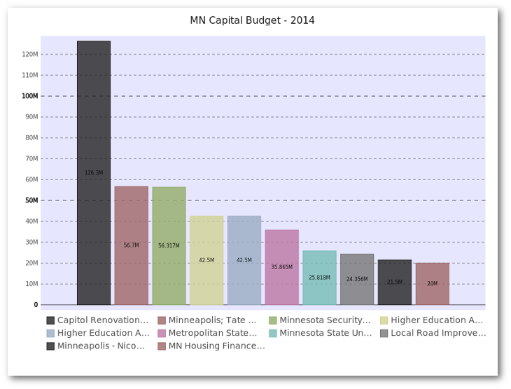
We will use the same budget lines for all of our examples. Here is what the top 5 items look like:
| category | detail | amount | |
|---|---|---|---|
| 46 | ADMINISTRATION | Capitol Renovation and Restoration Continued | 126300000 |
| 1 | UNIVERSITY OF MINNESOTA | Minneapolis; Tate Laboratory Renovation | 56700000 |
| 78 | HUMAN SERVICES | Minnesota Security Hospital - St. Peter | 56317000 |
| 0 | UNIVERSITY OF MINNESOTA | Higher Education Asset Preservation and Replac… | 42500000 |
| 5 | MINNESOTA STATE COLLEGES ANDUNIVERSITIES | Higher Education Asset Preservation and Replac… | 42500000 |
Now, setup our display to use nicer defaults and create a bar plot:
pd.options.display.mpl_style = 'default'
budget_plot = budget.plot(kind="bar",x=budget["detail"],
                          title="MN Capital Budget - 2014",
                          legend=False)
This does all of the heavy lifting of creating the plot using the “detail” column as well as displaying the title and removing the legend.
Here is the additional code needed to save the image as a png.
fig = budget_plot.get_figure()
fig.savefig("2014-mn-capital-budget.png")
Here is what it looks like (truncated to keep the article length manageable):
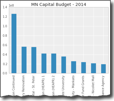
The basics look pretty nice. Ideally, I’d like to do some more formatting of the y-axis but that requires jumping into some matplotlib gymnastics. This is a perfectly serviceable visualization but it’s not possible to do a whole lot more customization purely through pandas.
Seaborn
Seaborn is a visualization library based on matplotlib. It seeks to make default data visualizations much more visually appealing. It also has the goal of making more complicated plots simpler to create. It does integrate well with pandas.
My example does not allow seaborn to significantly differentiate itself. One thing I like about seaborn is the various built in styles which allows you to quickly change the color palettes to look a little nicer. Otherwise, seaborn does not do a lot for us with this simple chart.
Standard imports and read in the data:
import pandas as pd
import seaborn as sns
import matplotlib.pyplot as plt

budget = pd.read_csv("mn-budget-detail-2014.csv")
budget = budget.sort('amount',ascending=False)[:10]
One thing I found out is that I explicitly had to set the order of the items on the x_axis using x_order
This section of code sets the order, and styles the plot and bar chart colors:
sns.set_style("darkgrid")
bar_plot = sns.barplot(x=budget["detail"],y=budget["amount"],
                        palette="muted",
                        x_order=budget["detail"].tolist())
plt.xticks(rotation=90)
plt.show()
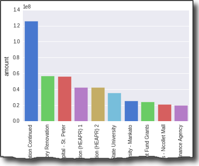
As you can see, I had to use matplotlib to rotate the x axis titles so I could actually read them. Visually, the display looks nice. Ideally, I’d like to format the ticks on the y-axis but I couldn’t figure out how to do that without using plt.yticksfrom matplotlib.
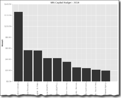
ggplot
ggplot is similar to Seaborn in that it builds on top of matplotlib and aims to improve the visual appeal of matplotlib visualizations in a simple way. It diverges from seaborn in that it is a port of ggplot2 for R. Given this goal, some of the APIis non-pythonic but it is a very powerful.
I have not used ggplot in R so there was a bit of a learning curve. However, I can start to see the appeal of ggplot. The library is being actively developed and I hope it continues to grow and mature because I think it could be a really powerful option. I did have a few times in my learning where I struggled to figure out how to do something. After looking at the code and doing a little googling, I was able to figure most of it out.
Go ahead and import and read our data:
import pandas as pd
from ggplot import *

budget = pd.read_csv("mn-budget-detail-2014.csv")
budget = budget.sort('amount',ascending=False)[:10]
Now we construct our plot by chaining together a several ggplot commands:
p = ggplot(budget, aes(x="detail",y="amount")) + \
    geom_bar(stat="bar", labels=budget["detail"].tolist()) +\
    ggtitle("MN Capital Budget - 2014") + \
    xlab("Spending Detail") +  \
    ylab("Amount") + scale_y_continuous(labels='millions') + \
    theme(axis_text_x=element_text(angle=90))
print p
This seems a little strange - especially using print p to display the graph. However, I found it relatively straightforward to figure out.
It did take some digging to figure out how to rotate the text 90 degrees as well as figure out how to order the labels on the x-axis.
The coolest feature I found was scale_y_continous which makes the labels come through a lot nicer.
If you want to save the image, it’s easy with ggsave :
ggsave(p, "mn-budget-capital-ggplot.png")
Here is the final image. I know it’s a lot of grey scale. I could color it but did not take the time to do so.
Bokeh
Bokeh is different from the prior 3 libraries in that it does not depend on matplotlib and is geared toward generating visualizations in modern web browsers. It is meant to make interactive web visualizations so my example is fairly simplistic.
Import and read in the data:
import pandas as pd
from bokeh.charts import Bar

budget = pd.read_csv("mn-budget-detail-2014.csv")
budget = budget.sort('amount',ascending=False)[:10]
One different aspect of bokeh is that I need to explicitly list out the values we want to plot.
details = budget["detail"].values.tolist()
amount = list(budget["amount"].astype(float).values)
Now we can plot it. This code causes the browser to display the HTML page containing the graph. I was able to save a png copy in case I wanted to use it for other display purposes.
bar = Bar(amount, details, filename="bar.html")
bar.title("MN Capital Budget - 2014").xlabel("Detail").ylabel("Amount")
bar.show()
Here is the png image:
As you can see the graph is nice and clean. I did not find a simple way to more easily format the y-axis. Bokeh has a lot more functionality but I did not dive into in this example.
Pygal
Pygal is used for creating svg charts. If the proper dependencies are installed, you can also save a file as a png. The svg files are pretty useful for easily making interactive charts. I also found that it was pretty easy to create unique looking and visually appealing charts with this tool.
Do our imports and read in the data:
import pandas as pd
import pygal
from pygal.style import LightStyle

budget = pd.read_csv("mn-budget-detail-2014.csv")
budget = budget.sort('amount',ascending=False)[:10]
We need to create the type of chart and set some basic settings:
bar_chart = pygal.Bar(style=LightStyle, width=800, height=600,
                      legend_at_bottom=True, human_readable=True,
                      title='MN Capital Budget - 2014')
One interesting note is human_readable which does a nice job of formatting the data so that it mostly “just works.”
Now we need to add the data to our chart. This is where the integration with pandas is not very tight but I found it straightforward to do for this small data set. Performance might be an issue when there are lots of rows.
for index, row in budget.iterrows():
    bar_chart.add(row["detail"], row["amount"])
Now render the file as an svg and png file:
I think the svg presentation is really nice and I like how the resulting graph has a unique, visually pleasing style. I also found it relatively easy to figure out what I could and could not do with the tool. I encourage you to download the svg file and look at it in your browser to see the interactive nature of the graph.
Plot.ly
Plot.ly is differentiated by being an online tool for doing analytics and visualization. It has robust API’s and includes one for python. Browsing the website, you’ll see that there are lots of very rich, interactive graphs. Thanks to the excellentdocumentation, creating the bar chart was relatively simple.
You’ll need to follow the docs to get your API key set up. Once you do, it seems to all work pretty seamlessly. The one caveat is that everything you are doing is posted on the web so make sure you are ok with it. There is an option to keep plots private so you do have control over that aspect.
Plotly integrates pretty seamlessly with pandas. I also will give a shout out to them for being very responsive to an email question I had. I appreciate their timely reply.
Setup my imports and read in the data
import plotly.plotly as py
import pandas as pd
from plotly.graph_objs import *

budget=pd.read_csv("mn-budget-detail-2014.csv")
budget.sort('amount',ascending=False,inplace=True)
budget = budget[:10]
Setup the data and chart type for plotly.
data = Data([
    Bar(
        x=budget["detail"],
        y=budget["amount"]
    )
])
I also decided to add some additional layout information.
layout = Layout(
    title='2014 MN Capital Budget',
    font=Font(
        family='Raleway, sans-serif'
    ),
    showlegend=False,
    xaxis=XAxis(
        tickangle=-45
    ),
    bargap=0.05
)
Finally, plot the data. This will open up a browser and take you to your finished plot. I originally didn’t see this but you can save a local copy as well, using py.image.save_as . This is a really cool feature. You get the interactivity of a rich web-based report as well as the ability to save a local copy to for embedding in your documents.
fig = Figure(data=data, layout=layout)
plot_url = py.plot(data,filename='MN Capital Budget - 2014')
py.image.save_as(fig, 'mn-14-budget.png')
Check out the full-interactive version too. You can see a lot more robust examples on their site.
The out of the box plot is very appealing and highly interactive. Because of the docs and the python api, getting up and running was pretty easy and I liked the final product.
Summary
Plotting data in the python ecosystem is a good news/bad news story. The good news is that there are a lot of options. The bad news is that there are a lot of options. Trying to figure out which ones works for you will depend on what you’re trying to accomplish. To some degree, you need to play with the tools to figure out if they will work for you. I don’t see one clear winner or clear loser.
Here are a few of my closing thoughts:
- Pandas is handy for simple plots but you need to be willing to learn matplotlib to customize.
- Seaborn can support some more complex visualization approaches but still requires matplotlib knowledge to tweak. The color schemes are a nice bonus.
- ggplot has a lot of promise but is still going through growing pains.
- bokeh is a robust tool if you want to set up your own visualization server but may be overkill for the simple scenarios.
- pygal stands alone by being able to generate interactive svg graphs and png files. It is not as flexible as the matplotlib based solutions.
- Plotly generates the most interactive graphs. You can save them offline and create very rich web-based visualizations.
As it stands now, I’ll continue to watch progress on the ggplot landscape and use pygal and plotly where interactivity is needed.
Feel free to provide feedback in the comments. I am sure people will have lots of questions and comments on this topic. If I’ve missed anything or there are other options out there, let me know.
Raspberry PIを使ってスマートホームを実現する 0.インストール編
私は怠け者です。
眠くなってベットの上でウトウトしている時に、照明が付いていても照明を消す事が出来ません。寒くても布団から出たくないのでエアコンをつけたりしません。
音声で「電気消して!」とか「エアコンつけて!」とか出来たらいいなーと思っていて、Raspberry PIを導入すればいいんじゃないかと思いつつ、2年が過ぎました。
本日Raspberry PI3がリリースされたのですが、どこも売っていないので、まずはRaspberry PI2を買ってきました。
やりたい事をフェーズ分けして、ひとつずつ実行していきたいと思います。
Phase 1: 家の温度・湿度・気圧を可視化してそれをWEB上でリアルタイムに確認できること
Phase 2: WEBから照明とエアコンの設定を変更すること
Phase 2.5:音声認識によって、照明とエアコンの設定を変更すること
Phase 3: 音声認識によって、AV機器の設定を変えること
Phase 4: 家の温度・湿度に応じてエアコンを自動で調整すること
まずはインストールとsshの設定をして自分のmacbookから接続をしました。
ここまでは、ググればすぐ出てくるので割愛します。

次は、Phase 1: 家の温度・湿度・気圧を可視化してそれをWEB上でリアルタイムに確認できることでやらなければならない事を書いていきます。
データ可視化ツール おすすめ20選
Visual.ly
This is perhaps one of my favorite new online tools today. Visual.ly is built with social networking features in mind to connect members all around the world. Designers are able to submit their own projects on data visualization and infographics into their site gallery. The showcase can be broken down and sorted into further categories like Food, Environment, Technology, etc.

If you check out their labs page it includes some fantastic links about what the team is building. The ideal goal is to offer an interface for creating dynamic infographics directly within your browser. The tool isn’t currently live, although I have heard of some private beta testers. You can sign up with your email address to receive updates and possibly an invite for testing.
To add onto their networking features Visual.ly has provided a handful of partner pages. These are similar to a profile page where you can view comments, likes, views, and infographic submissions, but these are targeted towards big-name brands – think National Geographic, eBay, Skype, CNN, etc.
We Feel Fine
As advertised We Feel Fine is an exploration of human emotion. This is one of the most unique visualization engines I’ve ever seen built into a web page. To get started click the large button on their home page. The app will load according to which Operating System you’re running, but thankfully everything appears the same in your browser.

Along the top row you’ll find fly-out options to sort the data. Their criteria include age, gender, weather location, and even date. The project offers an extremely detailed analysis of the entire world’s emotions at any given point! It’s truly an astounding experiment for humankind.
As you click anywhere in the canvas the flying balls will scatter about. If you mouse over one of them it’ll provide a bit more detail, and clicking will open a whole new bar at the top. Many of the results are pulled from Twitter and actually include photo/video media as well. The number of emotions and feelings are beyond belief. You could easily blow away a few hours playing around in this app.
RSS Voyage
Another personal favorite of mine which really helps to visualize data around the web. If you log into RSS Voyage you are able to import custom RSS feeds into your account for one whole data graph. Alternatively on their homepage you can hit “Start” to go right into the app with default feeds. In this scenario RSS Voyage will pull from a few popular blogs such as The New York Times, Engadget, The Guardian, and others.

If you move through the graphic and click on a particular article the view is fixed on screen. This includes the title, a short description, meta data for the publishing date along with the live URL. If at any point you’d like to start creating your own RSS visualizations, all you need to do is create an account!
Signup is totally free and you can create your account through the registration form at the bottom of the page. As another bonus feature RSS Voyage allows you to easily set fullscreen mode to browse your RSS feeds in style.
Revisit
The official Revisit project is a way to redefine how we look at Twitter. With this tool you are able to create custom line maps of data connecting tweets related to one or many keywords. You can additionally add a title to your graph and share the link online (even onto Twitter).

Clicking on an individual breakaway line off the graphic will display further details. Tweets will often include metadata such as the time posted and important/related keywords. The search criteria are limited to standard Twitter notation which uses a comma separated list of keywords.
For the best results keep your queries below 4-5 words since Twitter often has a difficult time matching overly-complicated content. If interested I recommend viewing other projects located on the same website for creative data visualization.
Tag Galaxy
With a fun play on words Tag Galaxy is a really unique visualization tool. Their home page is clean and easy to understand with a single search form for tags on Flickr. In addition the bottom left corner houses some popular suggestions for new users. Simply enter a term and hit Enter as Tag Galaxy queries through Flickr photos.

Their rendering engine duplicates the look of our solar system with the central Sun representing the main search term. The orbit of external planets represents similar tags you can look through. This is one of the coolest visualization demos I’ve ever seen rendered with Flash.
Notice that as you hover over each planet it’ll provide you with a small preview number. This is the total number of queried photos found for that tag in Flickr. Clicking on the sun will open a sphere of related photo thumbnails, while rotating planets will add their search terms into the query. Naturally you can find out more about a photo by clicking to bring up full-view.
Google Fusion Tables
We all know about the powerhouse that is Google. They have been running some really fun experiments in the back of their labs for years, and Google Fusion Tables is one of these. To sign in all you need is a Google Account and some time to play around. This tool lets you share data openly online and build custom visualization graphics.

These can be imported from a .csv or Excel spreadsheet. Although not currently supported I would imagine Google will allow the import of Google Docs very soon. After logging in you’ll find a table of public data lists to demo with. These are updated constantly with new user submissions – and I’ve found some real kickers in here before! After opening a document the top toolbar has a Visualization link with additional menus to customize your graphic.
Dipity
Nothing can be more interesting than our history on this earth. There have been a lot of events over the past 10 or 20 years – let alone a decade or century! Dipity is a wonderful tool to create and externally embed custom interactive timelines. You can pin markers on important dates to include photos, links, audio/video, and other forms of media.

The service requires that you sign up for an account before creating timelines. They do offer a free plan with the option to upgrade to premium plan at a later date. Luckily the most popular member timelines are offered public, so you can easily sort through an exciting laundry list of dynamic timelines. My personal favorite is Steve Job’s Life and Career fully formatted with photos even up until 2011.
Many Eyes
Many Eyes is the unique data visualization tool put out by IBM. They offer a whole slew of categories to explore for customized data topics. Some of the most popular examples are featured on the home page, many of which are user-created. Examples include Number of 3D Films released from 2001-2010, and even a word/tag tree from Obama’s recent Jobs Speech.

To create a set you’ll need to first organize your data. This can be practically anything, but should be something relatable and easy to display. If you want to publicly store the visualizations I recommend creating a free account on the service. There are a ton of features available to members plus the added benefit and security of storing personal data sets. If you get lost spend some time browsing the FAQ/Tour page to learn a bit more about the Many Eyes’ interface.
WikiMindMap
Speaking of unique visualizers Wikipedia is also a network you don’t see developers playing with as much. This is surprising, since the main Wiki contains a ridiculously large amount of data! WikiMindMap lets you select a region and enter the URL for a page.

If your keyword doesn’t exactly match up with a page ID the app will offer you the closest suggestion. The link generated inside the circle will lead out to the main Wiki page, while the refresh link opens a tree of options. These are all related links pulled off the main wiki page coordinating to your keyword. It’s also really easy to switch onto a new root node by clicking the green refresh icon.
HTML Graph
It might seem like we’re trying to trick you, but HTML Graph works exactly as advertised. On the home page enter an URL to any website and hit Enter to generate a node graph. The entire applet is built using Java to help examine the HTML structure of your web page.

As explained on the details page each of the nodes is color-coded to represent a HTML tag. Blue represents anchor links, red for tables, violet for images and so on. The app doesn’t provide much practical benefit, although it is quite visually appealing.
The programmer Marcel Salathe has offered the open source code for others to mess around with. You can actually find more information about him on the author info page.
Axiis – Browser Market Share
Axiis is notably one of the most popular websites for data visualization software. On their homepage you can find a handful of cool downloads to run on your PC or Mac computer. However along with these resources there are plenty of tools online to fidget around with. Notably one of my favorites is the browser market sharing graphic.

W3Schools has been polling users and tracking browser stats for a few years now. Axiis has compiled a beautiful visualization graphic from 2002-2009 relating to the most popular web browsers. Among the many listed include Safari, Opera, Netscape, Internet Explorer, and Google Chrome. The list hasn’t been updated for 2010/2011 but we may see a newer infographic released in the coming months.
Tweet Spectrum
I’m sure when you think of data visualization Twitter is one of the first networks to pop up. There are billions of tweets flooding the Internet every day, so it comes as no surprise the network is huge. Tweet Spectrum is a custom built web app using Java. Enter two keywords you’d like to compare and the spectrum will fill in surrounding keywords.

This is a fantastic way to visualize words related to similar topics. For example you may enter “monkey” and “chimp” to find similar animals and lifestyle habits. It’s difficult to expect any typical results since Twitter is such a robust network, but this is what makes Tweet Spectrum so unique!
The app was created by developer Jeff Clark who runs a popular data visualization blog. On his site you can find loads of graphics and charts relating to visualizations over the years. He also hosts a slew of similar Twitter apps which you can find throughout his portfolio pages.
Wordle
Another really fun browser app is Wordle. You can play around with graphic visualizations of word clouds from practically any medium. Best of all you don’t even need to sign up for an account to create a mashup. Wordle gives you three options: pasting in custom text, adding the URL to a blog or feed, or using a Del.icio.us account name to display their tags in cloud format.

Wordle isn’t all about interactivity. Even just browsing through the site you can find a lot of really neat mashups from previous users. Check out the Wordle Gallery to see what I mean. The system is a bit convoluted to get adjusted with right away. I personally love text and word visualization trees.
The features Wordle offers are not something you can easily find in any standard web application. I highly recommend toying around with their interface even for just a few minutes – you won’t be disappointed.
Tag Crowd
Tag Crowd is an awesome web-based cloud visualization tool. You can paste in your own text or even link to another website online. The application will automatically parse the page for content and rearrange popular keywords by size and density.

There have been a few other popular solutions to this, however I feel that Tag Crowd is the most elegant, not to mention it doesn’t require installing any 3rd party software. They additionally offer you 3 choices: uploading a file (such as .doc or .pdf ), linking a web page, or directly pasting your content into a text area. There are also some configuration options including max and min word frequencies.
Vuvox
Vuvox is another interactive web app for designers and data lovers. You can share slideshows and photo galleries dynamically on your own website or profile page, but you aren’t limited strictly to photo media – in fact Vuvox allows for music and video uploads as well!

Notice this is another service which does require you to sign up for a free account before creating visualizations. This requirement is in place mostly to cut down on server costs from anonymous usage, but after joining you have access to some really fun tools for creating collages and data slideshows. Many users offer their creations publicly to browse through.
Vuvox has a featured gallery for exactly these types of presentations.
Yooouuutuuube
This custom-built app made it very popular in the blogosphere just a few years ago. Yooouuutuuube will create a trippy mashup wall of videos which you can configure through settings. Basically you enter a YouTube URL and choose how to tile the video frames.

The audio is synced perfectly, and the videos cascade by default. This means the lower screens will be in-sync while the upper frames seem to drag behind. You don’t see a lot of customizations with YouTube data, but this visualization app is just too cool to pass up! Check out my favorite example with scenes from Alice in Wonderland.
Analytics Visualization
Do you run any websites with visitor tracking data? Chances are you’ve heard of Google Analytics and at least toyed around with the service at some point. Juice Kit runs a fantastic appspot web interface called Analytics Visualization. After connecting into your Google Account the app can pull out data from any of your profiles.

This lets you organize and examine number of pageviews, popular page content, and related keywords throughout Analytics. Each of your websites can be configured to display data in a weekly/monthly/yearly cycle. The graphics can be split into a word tree or block area content, respectively. Check out the Juice Analytics official website to learn more about the company and their goals online.
Newsmap
Here’s another really fun tool to examine the latest news around the world. Newsmap was built by a Japanese developer to import all the latest articles from Google News. The mosaic displayed in-browser can be customized by region and category. There is additionally some really great search functionality built into the top-right corner.

If you notice an interesting news story, hover over the block area to be given a preview image. This often includes some of the article text along with a link to the domain URL and time of publication. Articles with a larger block are generally more popular among Google users. The visualization techniques used are perfect for those looking to check news at a glance among a wide range of topics.
If you didn’t notice by now each of the news blocks are color-coded to match a selected category. You can figure out which ones are matched in the key menu at the bottom.
LinkedIn Labs – InMaps
Big fans of LinkedIn will really enjoy this app. The developers of LinkedIn have been working on private apps in their Labs area. This is similar to how Google, Digg, and other popular social networks have begun tinkering with new features. Simply connect into your LinkedIn account and InMaps will do the rest!

The visualization is performed in-browser with a complicated web of connections. These stem from your main network node to include your friends and people you may know. In simpler terms you are constructing a map of your professional relationships on LinkedIn. All the maps use a stringy color-coded formatting effect but you can rearrange the look by clicking “Next Map” in the bottom-right corner.
Wolfram Alpha
We are all familiar with Wolfram Alpha by now, or at least heard some ideas about the search engine. The goal was to build where Google left off by taking in arguments far more complicated than general searches. These include mathematical graphs, unit conversions, historical events, and scientific formulas.

It’s more of a wiki of scientific information combined with a dynamic computer search, and the developers are constantly refining how search keywords are used to display results. For those of you still confused check out their quick site tour to get a better idea. Not everyone will find Wolfram useful but it is a very mathematical tool to have accessible from any browser.
Global Incident Map – Earthquakes
Earthquake is a natural phenomenon we have to deal with, but luckily humans have evolved over thousands of years to develop useful technology to aid us in survival. Global Incident Map is a visualization tool that is powered through Google Maps. You can check out fires, AMBER alerts, aviation accidents, and a lot of others.

The earthquakes map is updated locally and fresh to the minute. Below the actual map is a table sorted by most recent EQs worldwide. Important data is included such as geo-coordinates around the globe, magnitude, and depth. These days you can never be too careful, and this is one piece of technology I’m happy to have at my fingertips!
Google Public Data Explorer
Here we have another cool Google project that is distinctly different from Fusion Tables. Public Data Explorer is a unique app which lets Google users upload and check out older data sets. This includes practically anything from worldwide fertility rates to US unemployment ratings. You also have Google’s graphic engines at your disposal to mockup the data in any way you choose.
