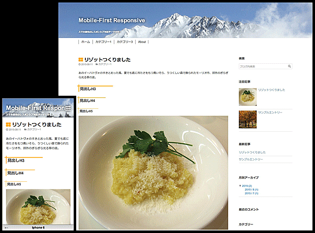
- モバイルファーストのレスポンシブテーマです。
- モバイル、タブレットは1カラム、デスクトップは2カラムとなります。
- コンテンツスペースを確保するためにブログタイトル部分は狭めです。
- カテゴリーを javascript でメニューバー化し、モバイルではバーガーメニューになります。
デモサイト
http://ausnichts.hatenadiary.jp/
レスポンシブ
デザイン→スマートフォン→詳細設定→レスポンシブデザインにチェックし、
デザイン→カスタマイズ→デザインcssに /* Responsive: yes */ を追加してください。
メディアクエリは次の指定をしています。
@media (min-width: 768px) { タブレット用 }
@media (min-width: 1024px) { デスクトップ用 }
メニューバーなど解説
メニューバーはjavascriptを入れないと表示されません。
その他詳細は下記サイトを参照してください。
http://www.imuza.com/entry/2015/08/14/221552
カスタマイズ
ブログタイトルの背景はヘッダに背景画像を指定することを想定していますが、背景色を指定したい場合は、
#blog-title-inner { background-color: 背景色; }
デスクトップでの最大幅は1200pxに指定していますが、変更する場合は、
@media (min-width: 1024px) {
#title, #content-inner, #menubar ul { max-width: 指定幅; }
}
サムネイルのH3~H5のcssは、
.entry-content h3 { position: relative; border-left: 3px solid orange; padding: 10px 0 0 5px; }
.entry-content h3:before { background: orange; content: ""; height: 3px; left: -10px; position: absolute; top: 7px; width: 200px; }
.entry-content h4 { position: relative; border-left: 2px solid orange; padding: 10px 0 0 5px; }
.entry-content h4:before { background: orange; content: ""; height: 2px; left: -10px; position: absolute; top: 7px; width: 160px; }
.entry-content h5 { position: relative; border-left: 1px solid orange; padding: 10px 0 0 5px; }
.entry-content h5:before { background: orange; content: ""; height: 1px; left: -10px; position: absolute; top: 7px; width: 120px; }
をデザインcssに追加してください。
更新情報
2015.8.26 カテゴリーページの日付表示修正
2015.8.17 H3~H5のボーダー削除(上のカスタマイズを参照してください)
2015.8.15 lessファイル公開
2015.8.14 公開


